

How Book Covers Influence Reader Decisions
A great book cover is one of the most important marketing tools in publishing. Readers can decide within seconds whether your book is compelling or worth a closer look. The cover is often the first signal of quality a reader sees when searching for new books, so each design requires careful consideration.
Whether you’re working with a designer or creating your own, understanding what makes a cover effective will help you attract the right readers and represent your book accurately.
In this guide, we cover the essential principles behind strong cover design, how to align your cover with your genre, the biggest mistakes to avoid, and practical ways to test whether your cover is truly working. By the end, you’ll know how to create a book cover that stands out from the big picture to the details.
What Makes a Great Book Cover?
A great book cover signals the book’s genre, appeals to the intended reader, and looks professional at any size. When someone scrolls past your thumbnail on Amazon or picks up your paperback in a store, the cover should clearly communicate what kind of experience they’re about to get. Strong covers focus on clarity, good typography, and a clean visual concept that supports the story.
The Three Core Elements
➥ Clarity: A reader should understand the general tone and category of your book at a glance. If a stranger can’t tell what kind of book it is, the cover isn’t doing its job.
➥ Appeal: Your cover needs to look at home among the bestsellers in your genre. This doesn’t mean copying trends; it means understanding what readers respond to and using those cues to your advantage.
➥ Legibility: Your title and author name must be readable, especially at thumbnail size. Clean typography, smart contrast, and thoughtful spacing make a bigger difference than you might expect.
These elements are the building blocks of a great book cover, and maintaining each one throughout the design process can require multiple revisions. This is because cover designs can become busy with visual elements during brainstorming, which leads to less clarity or legibility.
Understanding Your Genre’s Visual Language
Every genre of book cover has a visual language that instantly tells readers, “This book is for you.” Specific colors, fonts, and imagery act as artistic shorthand that communicates the mood and tone of the genre. When your cover aligns with those expectations, you’re helping the right audience find your book faster. This goes beyond the idea of adhering to the latest trends, and can prevent confusion in potential readers. When a cover design ignores genre signals, readers can become confused, and confused readers rarely click “buy.”
Why Genre Alignment Matters
Readers rely on patterns. For example, romance readers expect warmth and intimacy, but thriller readers expect tension and contrast. Readers immediately understand what kind of story or information you’re offering when the cover matches the visual language they are expecting. That clarity builds trust before they’ve read a single sentence.
Here are some examples of the visual languages commonly associated with popular book genres:
➜ Romance: Softer palettes, clean or script typography, character-focused imagery, and a sense of connection or emotion.
➜ Thriller & Mystery: Darker tones, bold sans-serif fonts, high contrast, and imagery that creates intrigue or unease.
➜ Fantasy: Dramatic lighting, illustrated elements, ornate or custom typography, and a sense of worldbuilding.
➜ Nonfiction: Minimal layouts, strong hierarchy, clean lines, and colors associated with credibility (often blues, blacks, or neutrals).
How to Research Your Genre’s Market
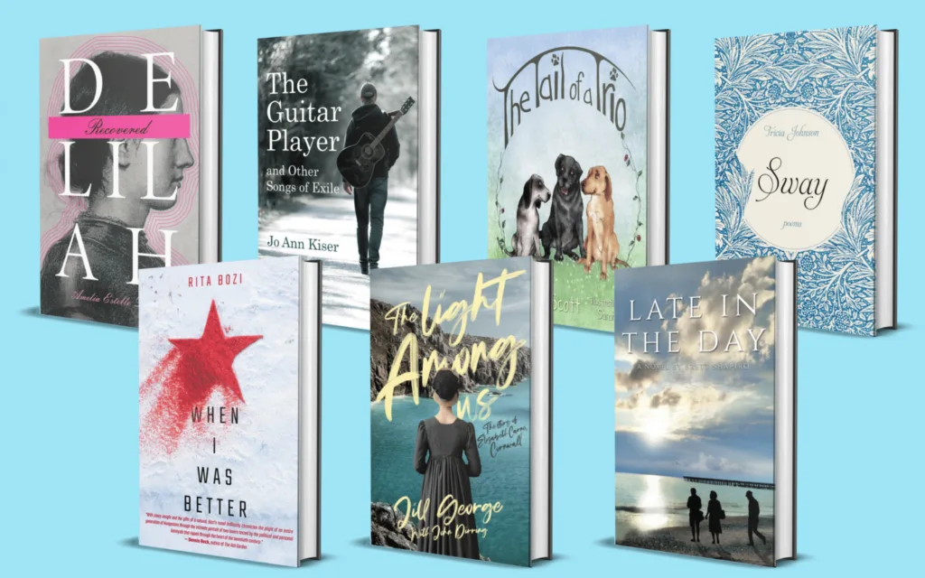
The simplest way to understand your genre category is to study the covers of the best performing recent books within it. Search multiple retailers and trusted online sources for the top 20 books in your category, and organize them for future reference.
Take note of recurring design choices like color palettes and font style. Keep your eyes open for any trends in design elements, like character illustrations or abstract backgrounds, that you may want to lean into when brainstorming. Your goal isn’t to replicate these covers, but to understand the common threads so yours feels intentional and competitive.
Core Design Principles Every Author Should Know
You don’t need to be a designer to recognize what works, but you do need to understand the principles that make a cover feel polished and intentional. These fundamentals apply no matter your genre or budget, and they can make the difference between a cover that looks amateur and one that feels publication-ready.
Typography Basics
Typography is one of the quickest ways a cover communicates professionalism. Start your creative process with the following design needs in mind:
✦ Choose fonts that match your genre. A thriller might lean on bold sans-serifs, while a fantasy novel might use something more ornate.
✦ Establish hierarchy. The title should be the first thing readers notice, followed by your subtitle and then your name.
✦ Avoid effects that date your cover. Bevels, shadows, outlines, and novelty fonts tend to look unpolished. Clean, confident type is always a safer choice.
Imagery That Works
Good imagery reinforces your book’s tone without overwhelming the layout.
✦ Prioritize clarity over complexity. One strong focal point is more effective than a crowded collage of setpieces and character illustrations.
✦ Avoid overused stock photos. If the image looks generic, readers will assume the book is too.
✦ Choose illustration or photography based on genre norms. For example, illustrated covers are thriving in fantasy and contemporary romance, while photography dominates nonfiction and thrillers.
Color Theory
Color sets the emotional temperature of your cover and helps highlight your typography.
✦ Use color intentionally. Dark, cool colors suggest mystery or seriousness; bright, warm palettes feel cozy or adventurous.
✦ Check for contrast. If your title blends into the background, the cover will lose impact especially at thumbnail size. Maintain contrast between focal design elements as well, but not so much that they are competing for attention.
✦ Stay within a controlled palette. Two to three colors are usually enough to create a cohesive, modern look.
Should You Hire a Professional Cover Designer?
A professional cover designer brings expertise that authors don’t typically have: an understanding of genre expectations, access to high-quality imagery, and the technical skill to create files that meet retailer and printer standards. While not every project requires hiring a pro, it’s often the fastest way to get a market-ready cover that performs well.
Pros of Hiring a Pro
➜ Genre fluency: Designers know what readers expect before they even read the blurb, and they build the cues readers want directly into the cover.
➜ Technical polish: From typography to color balance to composition, they understand what makes a cover look like it belongs on a shelf and not like a template.
➜ Consistent branding: Professionals can create ebook, print, and audiobook versions of book covers that match seamlessly.
➜ Higher-quality assets: Designers often have access to premium images, fonts, and tools that elevate the final result.
Budget & Cost Ranges
Cover design pricing varies widely, but most authors fall somewhere between:
$150–$400 for premade covers
$300–$800 for custom work from newer designers
$800–$1,500+ for experienced professionals or complex designs
Your choice depends on your budget, your genre’s competitiveness, and how important visual branding is for your book or series.
How to Vet a Designer
✦ Review their portfolio: Look for covers that feel modern, clean, and competitive in your genre. Take note of any popular books you recognize, because they could be a sign of the designer’s major successes.
✦ Ask about rights and licensing: Ensure images and fonts are legally usable for commercial book sales.
✦ Understand the revision process: Ask how many rounds of changes are included and how long the project will take.
✦ Request source files if needed: Some authors want layered files for future updates, so it is best to clarify if you’d like these up front.
DIY Book Covers: When It Works and When It Doesn’t
Designing your own book cover can be a cost-saving option, and it can lead to strong results for some authors with design experience. But DIY only works if you’re willing to follow genre standards, work with high-quality assets, and keep the design simple. If you’re unsure about your skills or your genre is visually competitive, hiring a professional is usually the safer route.
Tools Authors Can Use
You don’t need expensive software to experiment with cover design. A few widely used options include:
✱ Canva: Accessible and intuitive, with templates that can help guide beginners.
✱ BookBrush: Built specifically for authors, with features tailored to publishing.
✱ Affinity Photo: A one-time purchase alternative to Photoshop with strong capabilities.
Common DIY Pitfalls
Most DIY covers fall short for the same predictable reasons:
➜ Too many fonts: Mixing multiple typefaces creates visual noise.
➜ Cluttered layouts: Too many images or elements fight for attention.
➜ Weak contrast: Titles become unreadable against busy backgrounds.
➜ Low-quality source images: Generic or pixelated stock photos instantly signal “amateur.”
A Simple DIY Formula
If you do choose to design your own cover, a minimalist approach will serve you best:
➥ Pick one strong focal image to anchor the layout.
➥ Use a limited color palette of two or three complementary colors.
➥ Choose one serif and one sans-serif font—and use them consistently.
➥ Prioritize title readability, especially at thumbnail size.
This approach won’t replace a professional designer, but it can help you create a clean, competent cover that feels more intentional than improvised.
The Book Cover Creation Process, Step-by-Step
Whether you’re working with a designer or building the cover yourself, a structured process helps you make decisions with confidence. These steps keep the project focused, reduce revisions, and ensure the final design aligns with your goals and your genre.
Step 1: Define Your Book’s Positioning
Clarify who the book is for and what it promises before any visuals come into play. Are you offering fast-paced suspense, a cozy romance, or a thrilling mystery? Your cover should reflect that core identity. The clearer your positioning, the easier the design choices become.
Step 2: Research and Mood Board
Refer to your research on the bestselling books in your genre, and collect at least 10 covers that feel relevant. Identify the patterns you want to sample in your cover, and collect them into a mood board or inspiration folder. This can help remind you what’s working in the market and gives your designer (or yourself) a grounded starting point.
Step 3: Thumbnail Testing
Most readers encounter your cover at a tiny size. Shrink your draft to about 100px tall and check:
Can you read the title?
Does the imagery still make sense?
Does it look professional next to comparable books?
If the cover falls apart at the scale of a thumbnail, it won’t convert well online.
Step 4: Iteration & Feedback
Refine the layout through a few rounds of adjustments. Seek feedback from people who understand your genre—beta readers, ARC teams, critique partners, or writing groups. Focus on patterns in their comments rather than one-off preferences.
Step 5: Final Files & Formatting
Once the design is approved, make sure you have all formats you need:
✦ Ebook front cover (usually JPG)
✦ Print cover (full wrap with spine and back cover)
✦ Audiobook cover (square format)
✦ Files that meet retailer specs for bleed, trim size, and resolution
Start formatting your final files as soon as the materials are ready to avoid last-minute delays when you’re ready to publish.
How to Know If Your Book Cover Is Good
A strong cover doesn’t just look appealing—it performs. The easiest way to evaluate your design is to step back and look at it the way a potential reader would: quickly, visually, and without context. A good cover communicates genre, feels intentional, and holds up at every size and format.
Quick Self-Test Checklist
Use this simple checklist to gauge whether your cover is doing its job:
✔ It looks competitive next to the bestsellers in your category.
✔ The genre is instantly clear to someone who doesn’t know anything about the book.
✔ The title is readable at thumbnail size (around 100px tall).
✔ The design still works in black-and-white, which matters for Kindle e-ink devices and certain print proofs.
✔ It feels cohesive—the fonts, imagery, and colors all belong to the same idea.
Where to Get Feedback
Objective feedback is essential, especially if you’re too close to the project to judge it fairly. Some good places to get honest impressions include:
✦ Writing and publishing groups (Facebook, Discord, or critique communities)
✦ Your advance reader or beta reader group, since they know your tone and audience
✦ Professional designers, if you’re considering a consultation or redesign
Aim for feedback from people who read or write in your genre. They’re most equipped to notice whether the cover aligns with reader expectations. Try the following testing methods with your trusted groups to see which of your designs is the strongest.
Real-World Version Testing Methods
Social media polls: Post two or three cover options and see which gets the most positive engagement.
Mock ads: Run a small paid ad campaign with different covers to measure click-through rates. Publishers may plan these kinds of tests in advance to properly schedule the designer’s work.
The “Scroll Test:” Open a platform like Amazon or Goodreads and scroll quickly through thumbnails in your category. Your cover should catch the eye immediately.
FAQ: Quick Answers About Great Book Covers
These questions target common search queries and can appear as featured snippets or zero-click results.
What makes a book cover professional?
A professional cover uses clean and readable typography, aligns with genre expectations, and features high-quality imagery with a balanced layout.
How much should an author spend on a book cover?
Most authors spend between $150 and $1,500, depending on whether they choose a premade cover, a custom design, or an experienced designer for complex projects. $150–$400 for premade covers, $300–$800 for custom work from newer designers, and $800–$1,500+ for experienced designers and large marketing campaigns.
Can you design your own book cover?
Yes, if you follow genre standards, prioritize readability, and use high-resolution images. Minimalist designs often outperform cluttered DIY covers.
Should ebook and print covers be different?
The front cover should remain the same, but print covers include spine, back cover, and bleed specifications. File formats also differ for digital versus print.
How do I know if my book cover is effective?
An effective book cover should:
➥ Clearly convey genre
➥ Be readable at thumbnail size
➥ Look professional alongside competitors
➥ Pass feedback tests from your target audience
Ready to Get a Cover That Truly Represents Your Book?
If you want a book cover that captures your vision, fits your genre, and stands out in today’s crowded marketplace, working with a professional designer can make a big difference. At Atmosphere Press, our custom cover design team builds covers that are visually compelling, genre-appropriate, and tailored to your goals as an author.
Whether you’re preparing to publish your first book or refreshing an existing title, we can help you create a cover that resonates with readers from the very first glance.
